Meet Horizon UI · 3/17: Topology & Service Dependency
This is the third post in the Meet Horizon UI series. Part 2 was about reading your services as numbers on a dashboard; this one is about reading them as a map — who calls whom, how hard, and how that same logical service looks across every layer it reports through.
The call data behind a SkyWalking topology is one thing; the views Horizon draws from it are several. There’s the per-layer service map, a drill-down into the instances behind a single call, an endpoint-level dependency graph, and a cross-layer overlay that ties a service’s faces together. They’re all the same engine, pointed at different questions. (The Deployment tab — the map of one clustered service’s own instances — and the WebGL 3D map are big enough to get their own posts next.)
One topology engine, repainted per layer
Open any layer’s Topology tab and you get a left-to-right hierarchical service map: User (when present) seeds the left, and each service sits in a column by its call depth — within a column, nodes keep the order the graph walk reached them, so the dominant chain reads top-down. Each service is a hexagonal node, and everything it shows is driven by the layer’s config — nothing is hardcoded:
- the hexagon’s border carries the node’s ring metric as an SLA-style health band (green → red);
- the component icon sits inside the hex — the same icon set the trace waterfall uses, so a PostgreSQL node looks like PostgreSQL, a Kafka node like Kafka;
- the node’s headline number — its center metric — prints just above the hex, with its unit;
- the service name prints below it, and a secondary metric (latency, by default) sits beneath the name;
- each edge carries the call’s throughput as an RPM chip (the server-side metric, falling back to the client side).
Here’s the part worth stressing: every one of those is just the General layer’s bundled default. The node’s center / ring / secondary metrics and the edge metrics each live in the Layer dashboards admin → Topology scope as an MQE expression with a unit and a role — so you can point any slot at a different metric, and the same engine paints a different map for a different layer, or for this one your way. (The choices travel with the layer template’s export/import, like everything else.)
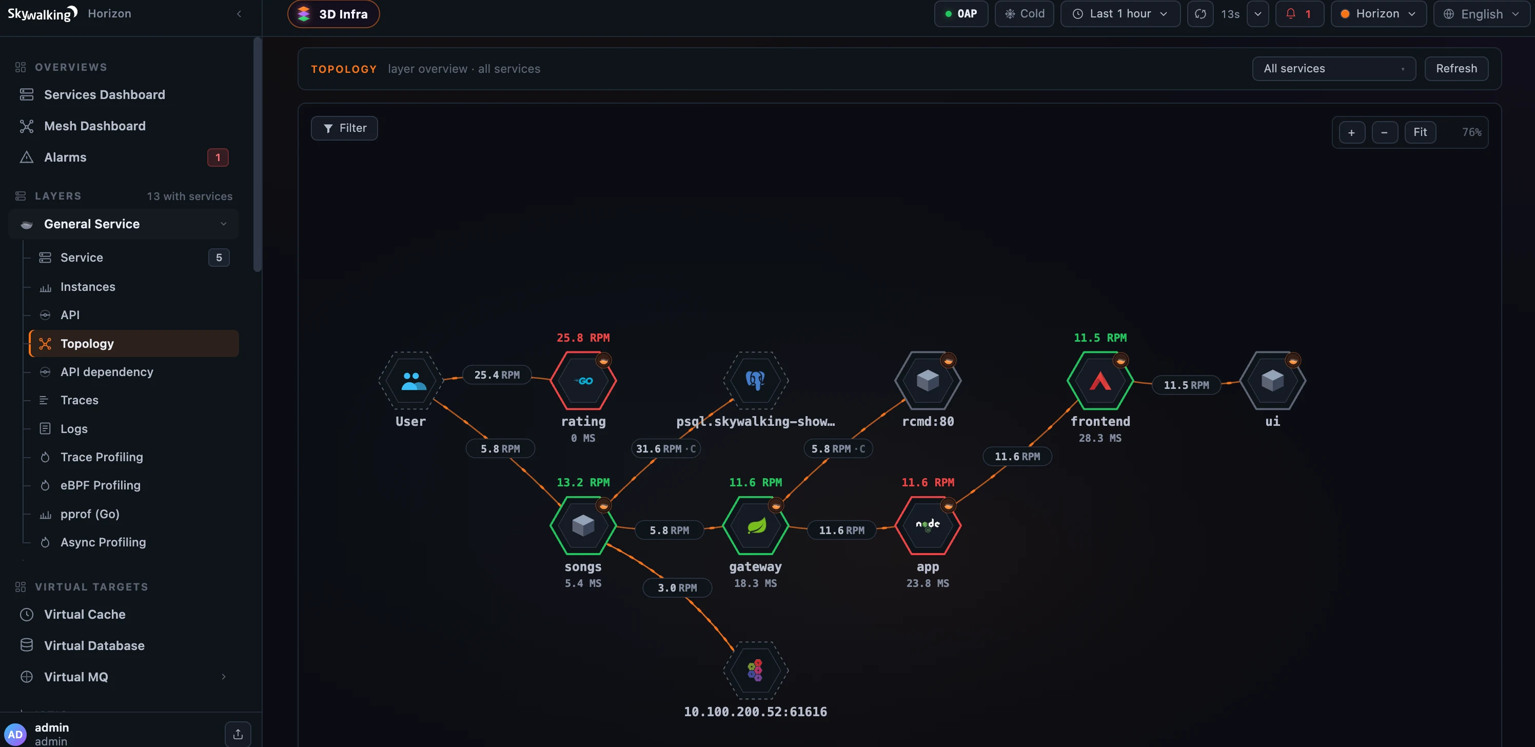 Figure 1: One template-driven topology engine — health-banded hex nodes, RPM-chipped edges, real component icons; every metric on it is configured per layer.
Cut the noise
Real topologies are noisy — a dense map fills with conjectured peers OAP couldn’t fully resolve (a bare rcmd:80, an un-instrumented address). Horizon’s Filter control turns those off without hiding your real dependencies. It derives one facet automatically — by layer — and presents it exactly as the sidebar does: each row carries the layer’s own icon and localized name (Virtual Database, Java Agent, …), plus an Others bucket for nodes OAP couldn’t classify and a standalone User toggle. Uncheck Others and the uninstrumented clutter — and its dangling edges — disappears, while your databases, caches and queues (separated by their own VIRTUAL_* rows) stay on the map. Filtering is client-side and the rows re-derive on every refresh, so it never goes stale.
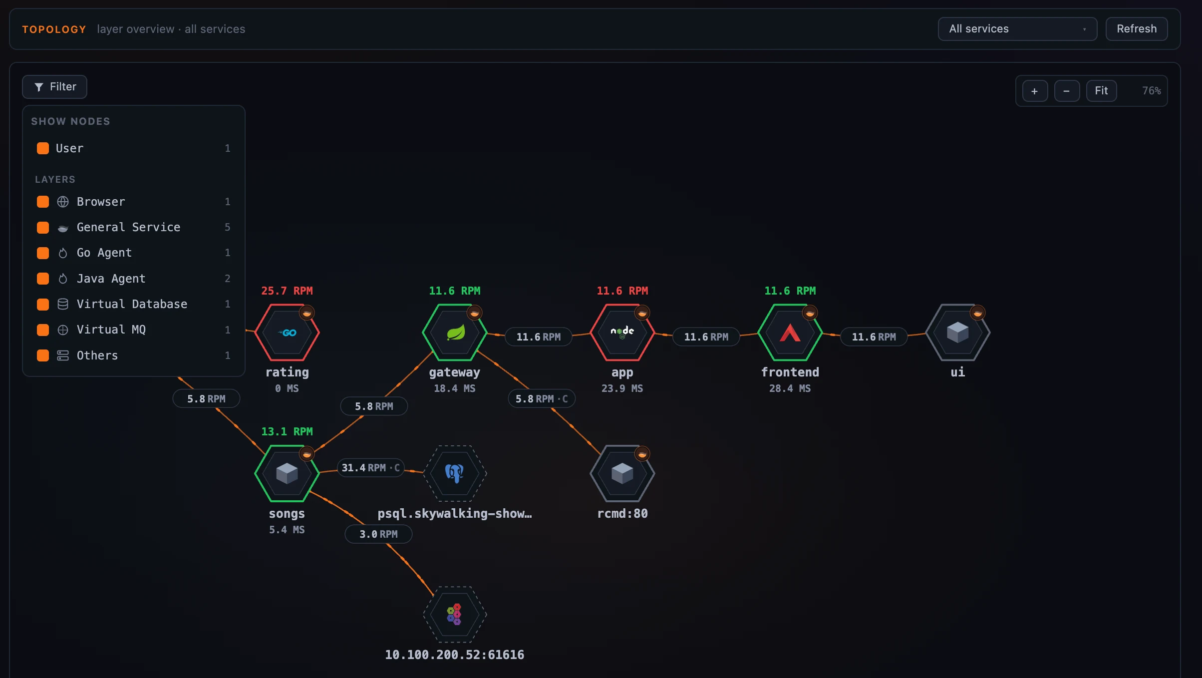 Figure 2: De-noise in one click — drop the unresolved “Others” peers and keep your real dependencies.
When a layer’s services fall into OAP service groups, the map’s service-focus selector groups by them too, and clicking a group header batch-selects or clears every service in that group — so you can focus a whole team’s slice of a busy map at once.
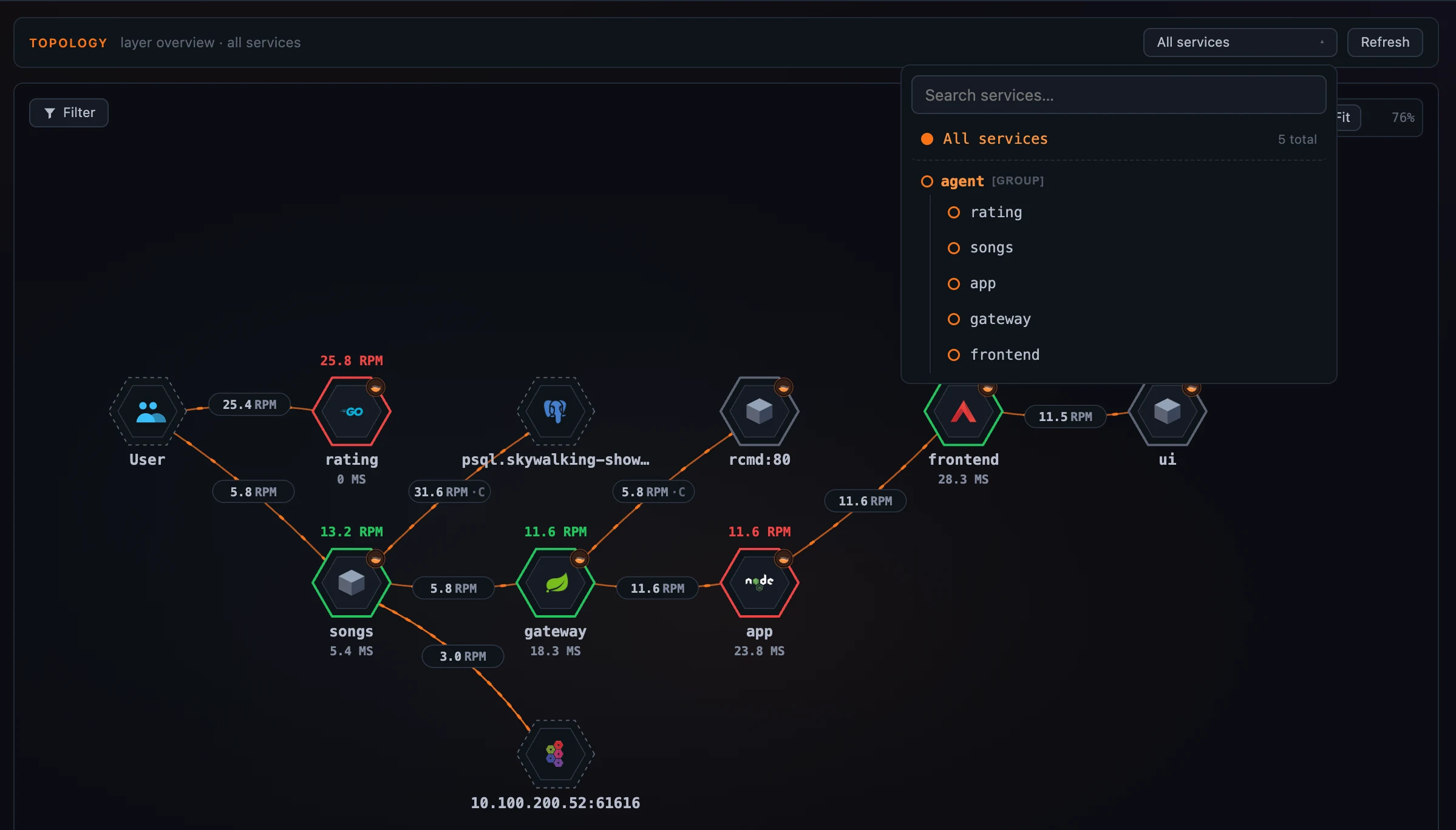 Figure 3: Focus a whole service group at once from the map’s selector.
Drill from a call into its instances
A service-to-service edge is an aggregate — behind it are real instances talking to real instances. Click a call on the map and choose Instance map →, and Horizon draws exactly that: the client service’s instances in the left column, the server service’s in the right, with the instance-level calls between them, animated client→server. It reuses everything from the service map — the health-ring nodes, the per-call client/server metric sidebar, a node popover with Open instance dashboard — and labels the columns in the layer’s own vocabulary (Pods on Kubernetes, Sidecars on the data plane). The two service pickers are relationship-aware: the server list is the chosen client’s callees, the client list is the chosen server’s callers, each re-deriving as you change the other.
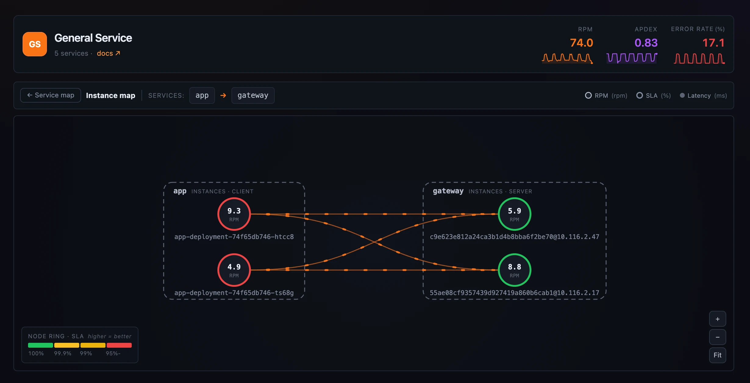 Figure 4: Drill from an aggregate call into the instance-to-instance traffic behind it.
Walk the request chain, endpoint by endpoint
Service topology answers “which services call this one.” The API dependency tab answers the sharper question — “which endpoints call this endpoint, and which does it call.” Pick an endpoint and it lays out in columns by direction: callers on the left, the focus endpoint in the centre, callees on the right, with the same SLA-coloured node border, the RPM and latency on every edge, and the heaviest edge labeled. A selected node shows a single + handle that pulls in its own callers and callees in one click, so you walk the chain one hop at a time instead of drowning in the whole graph; drag nodes apart, and the drill-out links (Open endpoint, Service →) open in a new tab so you keep the graph you’re exploring.
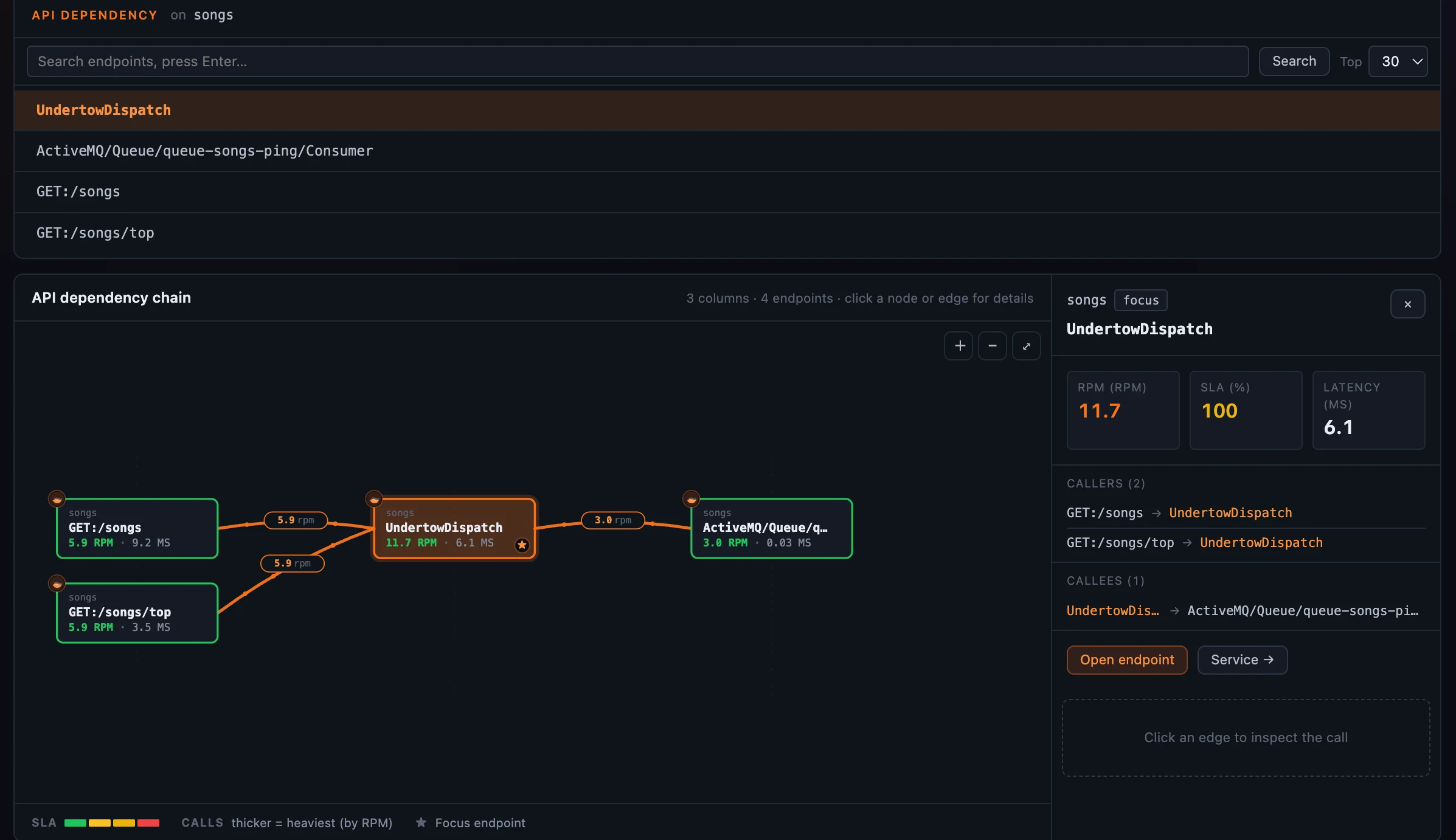 Figure 5: Walk the endpoint call chain a hop at a time, latency on every edge.
One service, every layer it reports through
A single logical service often reports through several layers at once — a General agent, a Service Mesh sidecar, the mesh data plane, a Kubernetes pod. SkyWalking has modeled that cross-layer hierarchy since OAP 10; what Horizon adds is making it one click from anywhere on the map. Select a node and Horizon lazily probes its hierarchy — if the service has cross-layer peers, a small chevron-stack chip clips to the node.
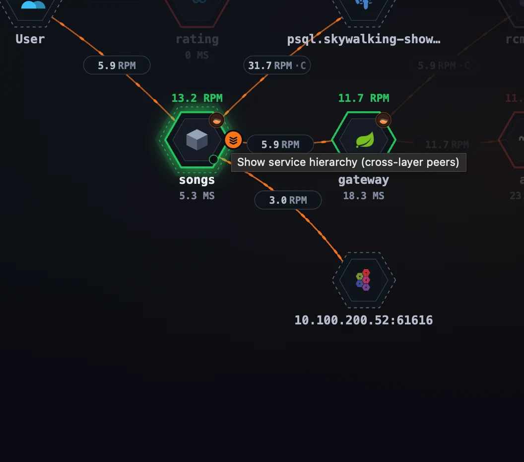 Figure 6: The chevron-stack chip on a selected node — lazily probed on selection, it shows only when the service has cross-layer peers.
Click the chip and the topology dims under a Smartscape overlay: the focused node re-renders bright in place, and its peers fan out vertically by OAP’s layer order — request-near layers above, infra-near below. From there a two-step click opens any peer in its own layer, pre-selected. (Auto-refresh pauses while the overlay is open so nothing shifts under you.)
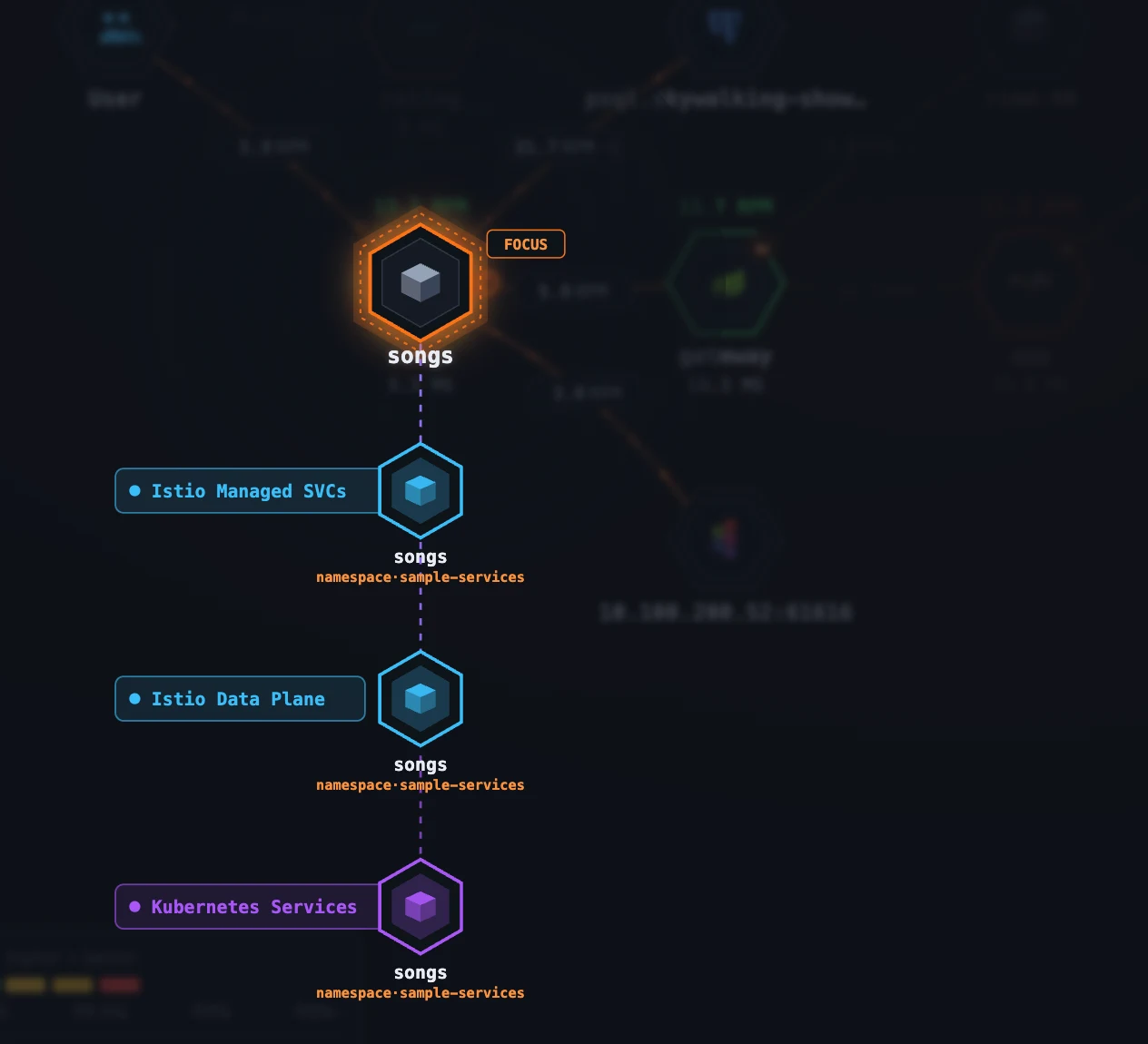 Figure 7: One service, every layer it reports through — the cross-layer hierarchy as a one-click overlay on the map.
Where to go next
Every metric, threshold, and edge weight on these maps lives in the layer template’s topology block — which means you tune them the same config-driven way you tune dashboards, the subject of a later post in this series. For the field reference, see the layer-template topology docs.
Next up: the Deployment tab and BanyanDB self-observability — where the same map technique turns inward to show how one clustered service’s own instances are deployed and talk to each other.